Project overview
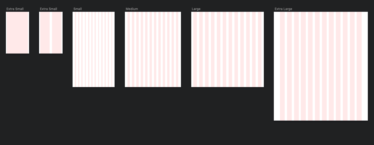
I was tasked with a redesign of a Crypto Currency site. The design is fully responsive and is using a Bootstrap Grid system.
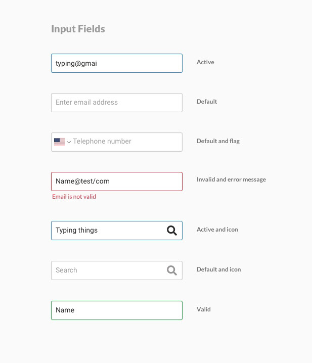
The aim of the project was to create a design system that would keep high consistency throughout the page templates, and at the same time cut down on design and development times.


I created button guide including primary, secondary and ghost buttons. The primary is a gold/yellow to reflect the financial aspect of the site and a secondary blue is chosen to be a less prominent color.

Font Guide for use within the design system.

Complementary colours were designed for use within the design system as a set theme. The design system we created which is detailed in the UX Case Studies section of this site, allows for multiple themes. This palette above is used on Buttons, Call Outs, UI backgrounds and Dividers and more. The background palette and dividers are neutral dark and light greys to let the content be the prominent parts of the design.

The german crytpo news logo is reflective of Crypto Coins without being too obvious, a strong graphic with modern and condensed font to show a serious side and a certain boldness.


