Introduction
Native app user interface design for a health care start-up. The app is to help professional carers work closely with their care recipient, giving them access to vital information, like medications, tasks, carer rota and more.
The Brief
I was asked to work in a rapid design sprint to create concept for a new health care app. The app would have two dashboards, one for the health care professional and another for the recipient and/or their relatives.
Rapid design sprint
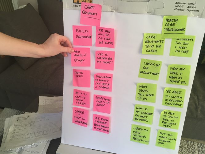
The process included research, mind mapping, card sorting, paper sketching of wireframes through to high fidelity UI design using Sketch app and finally prototyping in Marvel app ready for user testing.
Key Objectives
- Build trust, reduce anxiety by giving family a way to know how is caring for their relative.
- Be easy to use, one click away from all information.
- Check In – Check Out functionality for professional carer.
- Both health care professional and recipient profile bios.
- Recipient’s medical history and medication requirements.
- Care professional’s tasks manager, to view tasks, and mark as completed.
Establishing the visual language
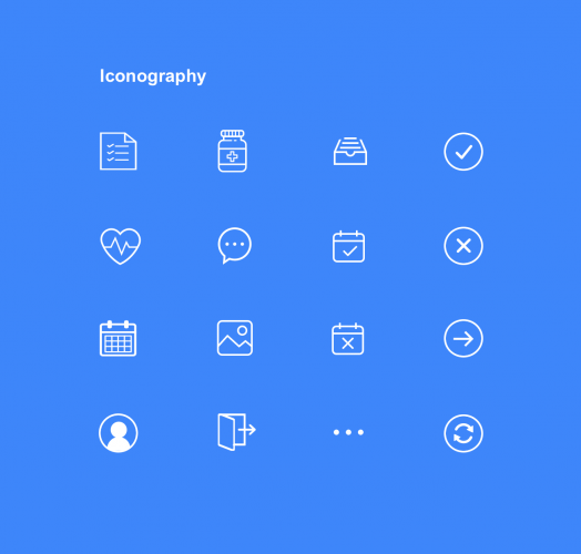
The next step was to settle on a set of consistent icons that could help users identify key tasks quicker. I opted for simple outline icons to avoid visual confusion and ensure simplicity.
I then created the UI palette from Elder’s existing brand colours and had to add some simpethetic UI colours
Recipient screen UI
![]() A greeting message helps the recipient feel comfortable and secure. Care professionals mini profile helps the care recipient’s or relative identify carers and find out a little about them before they start work. Indicator dots show more content is available.
A greeting message helps the recipient feel comfortable and secure. Care professionals mini profile helps the care recipient’s or relative identify carers and find out a little about them before they start work. Indicator dots show more content is available.
The active highlighted navigation content on the screen is of the professional profile, this helps the recipient connect and feel comfortable when the professional arrives, and makes it possible to see which professional is due each day.
Navigation is fixed on the left and is always present, everything is only one click away. All of the content appears on the right and is easily accessible.
There are numbered alerts alongside menu items, for example My Medication and My Messages.
Professionals screen
![]() I introduced the care recipient info in the form of a mini profile so that the professional can identify the recipient at a glance and find out a little about them before they start work.
I introduced the care recipient info in the form of a mini profile so that the professional can identify the recipient at a glance and find out a little about them before they start work.
The professional is required to check in and check out at the start and completion of every shift. I have used a toggle button using the brand’s existing colour scheme, green has been used for Check In and red for Check Out.
There are numbered alerts for the professionals for example the My Tasks menu item. A welcome message conveys friendliness and todays date is useful to have in view.
A quick visualisation was requested to show how the Dashboard could translate to phone viewports.


