Native iOSTransactions UIFintechDesign SystemFigmaUX/UIMobileBranch Workflow
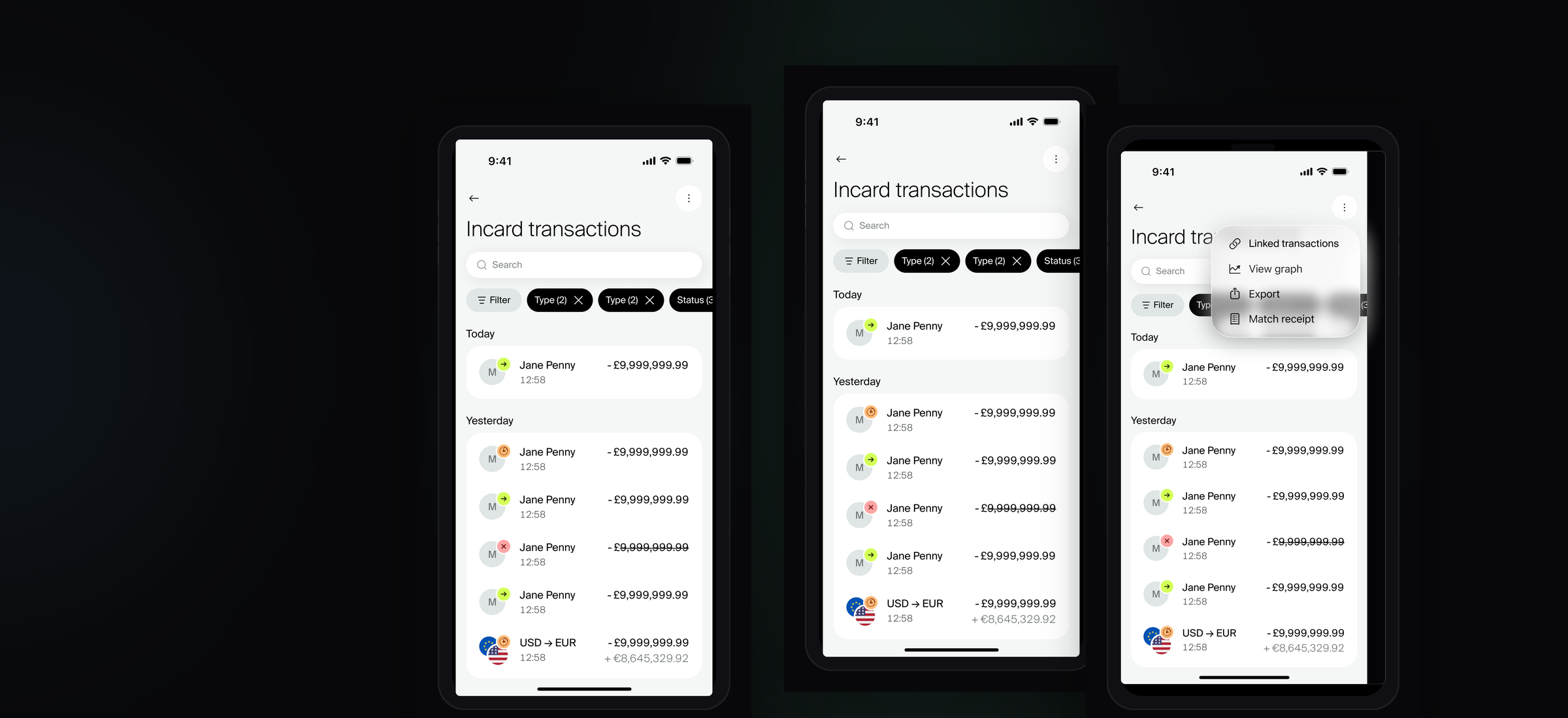
iOS transaction screens — list, search and detail views
Project Overview
Incard is a London-based fintech building what it describes as a financial OS for digital-first businesses — combining multi-currency accounts, corporate cards, cashback, and real-time spend visibility in a single platform. Having raised a £10m Series A, the product is scaling fast across the UK and EU, serving e-commerce brands, agencies, and high-growth startups.
This project was the Incard 2.0 redesign of the Transactions section — a ground-up rethink of one of the most data-heavy and interaction-critical areas of the app, informed by real customer feedback from the 1.0 product. Business owners and finance leads rely on this section daily to track spend across multiple cards and linked accounts, reconcile payments, and drill into individual transaction details. The challenge was designing something that handles genuine financial complexity while still feeling fast, clear, and native to each platform.
|
83 Distinct transaction |
12 Transaction categories |
100+ Individual screens |
Process & Foundation
The Transactions project benefitted from a significant amount of groundwork I had already invested in during my first months at Incard. Before this feature work began, I had led the migration of the entire product design system to the new Incard 2.0 brand — updating component libraries, colour systems, typography, and shared UI patterns across both iOS and web. That investment meant this project started from a solid, consistent foundation rather than having to resolve system-level decisions mid-feature.
Customer Feedback & Research Foundation
As a 2.0 redesign, the project had the advantage of real-world usage data and direct customer feedback from the existing product. Known friction points — around transaction clarity, status communication, filter discoverability, and the handling of linked account transactions — were documented and used as a concrete starting point for design decisions rather than assumptions. This grounded the work in genuine user need from the outset.
Information Architecture Workshops
Early in the process, I ran a series of IA workshops with the second designer and a developer to map out the full structure of the Transactions section before any screens were produced. These sessions established the navigation hierarchy, identified where features connected to each other (home screen, filters, detail views, export), and surfaced technical constraints early — ensuring the design direction was buildable and that handoff wouldn’t require significant rework.
Heuristic UX Reviews
Before committing to high-fidelity design, heuristic reviews were conducted against the existing 1.0 screens — evaluating them against established usability principles to systematically identify where the product failed users. This structured critique helped prioritise which problems to solve first and provided clear, evidenced rationale for design decisions throughout the project.
Iterative Design & Feedback Cycles
Screen design progressed through multiple rounds of review and refinement — starting from early-stage layouts that were deliberately kept low-fidelity to enable fast critique without attachment to detail. Feedback from product, engineering, and stakeholders was incorporated across several iterations before progressing to high-fidelity. This meant that by the time pixel-perfect screens were being produced, the structural decisions were already validated and agreed.
Interactive Prototypes for Complex Flows
For more complex interaction flows — such as the filter system, the linked account switcher, and the transaction detail tab navigation — static screens alone weren’t sufficient to communicate intent to stakeholders. Interactive prototypes were built using Figma’s native prototyping and Make, with additional AI-assisted tooling to demonstrate how screens function in motion. These prototypes were instrumental in aligning stakeholders on behaviour before development began, reducing back-and-forth during the build phase.
Branch-Based Figma Workflow
All design work was carried out on a dedicated Figma branch, keeping the main production file protected throughout. Exploratory work, iterations, and layout experiments happened in isolation — merging only once decisions were confirmed through the review process. This mirrors how engineering teams manage code branches and made stakeholder reviews, design QA, and handoff to development considerably cleaner.
Transaction List View
The transaction list is the entry point — where users land and scan first. The design needed to work across two distinct modes: Incard native transactions and linked external bank accounts. Each mode has its own data shape, visual treatment, and navigation behaviour, and users can switch between them seamlessly from the top action menu.
Key design decisions focused on scannability at pace. Merchant identity sits at the top of the visual hierarchy with the amount prominent to the right. Supporting metadata — card used, date group, account type — lives in a quieter secondary layer so it’s accessible without adding noise to the primary scan pattern.
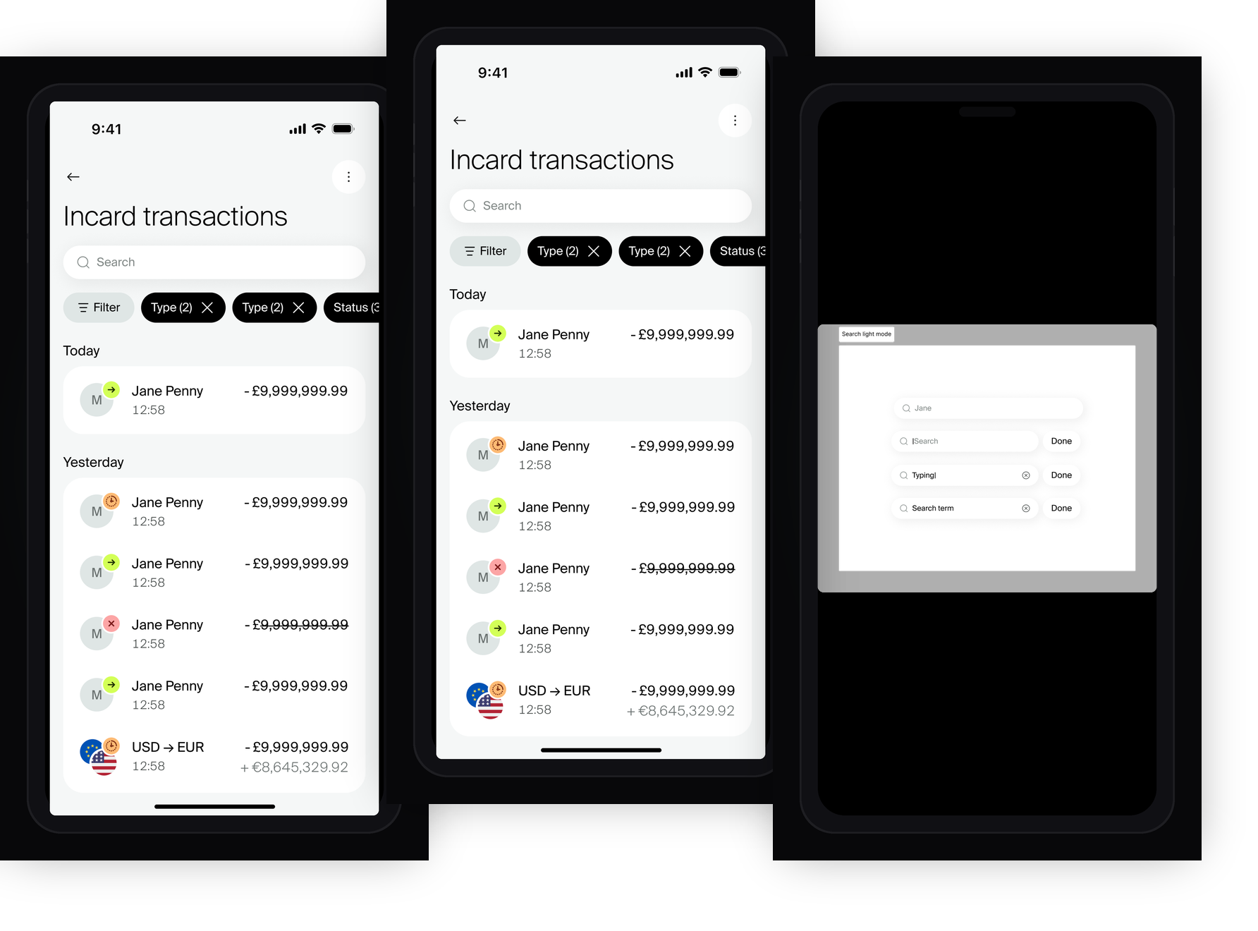
Left to right: scrolled state · default not-scrolled · action menu (account switcher)
Account Switching & Linked Transactions
Incard users can link external bank accounts and view those transactions alongside native Incard spend. The list had to support both views clearly — with visual differentiation for linked rows, distinct account labels, and a separate contextual action menu for switching modes.
Home Screen Integration
The transactions list surfaces in a condensed form on the home screen, filtered to the currently selected balance (Total, Incard, or Linked). Designing how the two views connected required careful thinking about data inheritance and navigation state.
Total Displayed & Currency Handling
When filters are active across multiple currencies, the total figure at the top of the list needed a note explaining it only reflects filtered items in the same currency — a small decision that prevents real user confusion in a financial context.
Transaction Row Component — 83 Variants
Before a single list screen could be finalised, the transaction row component had to be fully defined. Every transaction type surfaces differently — different icons, directional indicators, amount colours (debit black, credit green, declined struck through), and secondary FX amount labels. 83 distinct named variants were documented across 12 categories.
The 83 variants span 12 transaction categories — not every type supports every status, so valid permutations had to be mapped explicitly:
|
→ Transfers 8 variants |
⇄ Currency Exchange 6 variants |
👤 P2P 6 variants |
💳 Debit Card 6 variants |
|||
|
⚡ Incard Flex 5 variants |
🏧 ATM 2 variants |
⟳ Internal Transfers 6 variants |
📄 Incard Fees 10 variants |
|||
|
✦ Cashback & Rewards 3 variants |
🏦 Treasury & Savings 10 variants |
🔗 Linked Account 9 variants |
🏪 Merchant 7 variants |
|||
Search
Search was designed to work naturally within the iOS keyboard interaction model — activating inline without modal navigation. Both light and dark modes were fully designed, with real-time “typing — no results” states, populated results states, and the “done tapped” confirmation state handled distinctly.
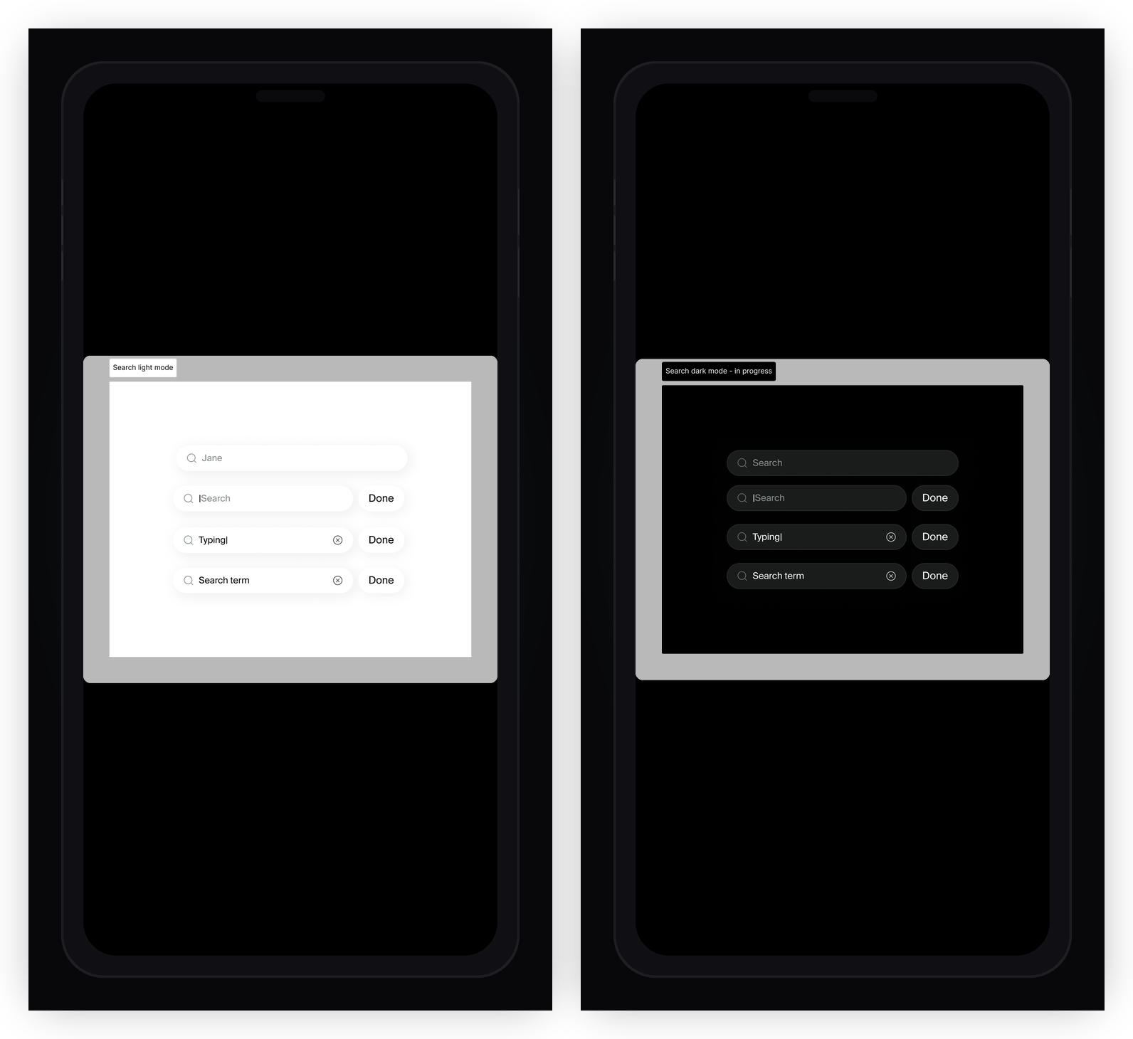
Search light mode · search dark mode (in progress)
Filters
The filter system was one of the most structurally complex parts of the project. Users needed to filter by date range (including a custom date picker), status, category, merchant, merchant type, team member, card, and linked account — each with its own selection sheet and scroll behaviour.
Applied filter chips persist above the transaction list so users always know what’s active and can remove individual filters without clearing everything. A detailed chip label spec defined exactly how each filter type should display once applied.
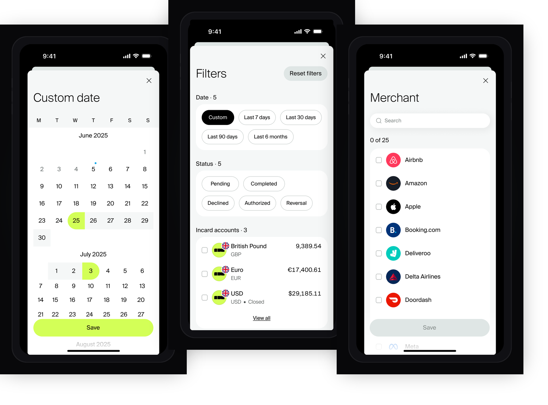
Custom date picker · main filter sheet · merchant selection
Transaction Detail Views
Each transaction type required its own detail screen — because the data fields, layout, and available actions differ significantly between a card payment, outbound transfer, ATM withdrawal, FX exchange, direct debit, cashback, reward redemption, or Incard fee. Designing for each type individually rather than forcing them into a single template was the right call.
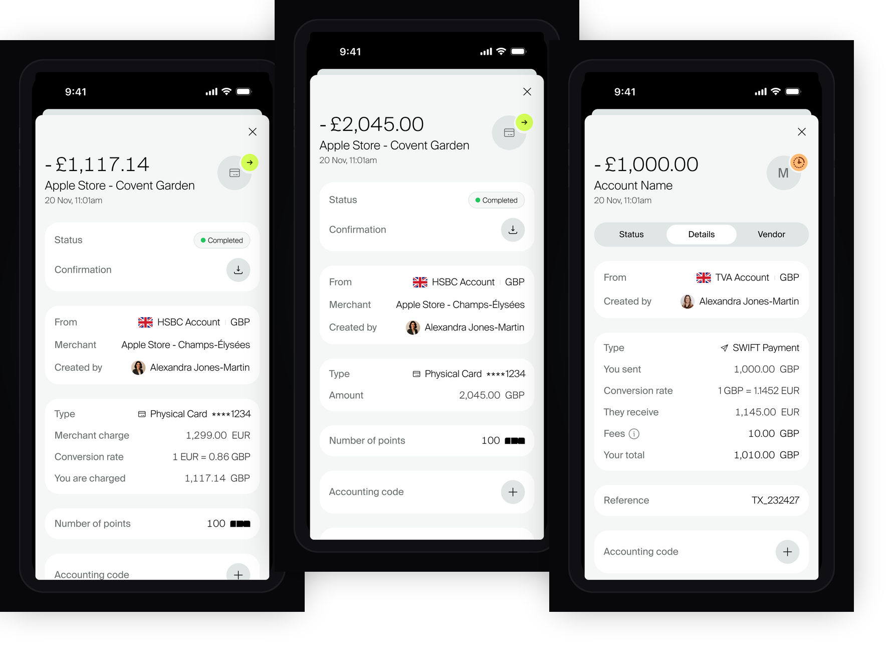
Card payment with FX · card payment no FX · outbound transfer no FX
Tab Structure: Details · Vendor · Status
Outbound transfers use a tabbed detail screen breaking data across Details, Vendor, and Status tabs. Each tab was designed independently with its own scroll states, and the Details tab had multiple sub-states as the user scrolls through the expanded panel.
Timeline States
The status timeline was designed with specific visual states: Sent, Received, Verified, Declined by Incard, and Under Review — using amber for pending and red only where action is genuinely required. Works across all transaction types without custom layouts per type.
Transaction Types Covered
Card Payment (no FX & with FX), Outbound Transfer, ATM, Direct Debit, FX Exchange (Bought & Sold legs), Linked Account flows, Incard Fees, Incard Adjustments, Cashback, Reward Redemption, Card Verification, Internal Transfers, Inbound from Another Sender, and Reverted Outbound Transfer — each with its own data layout and available actions.
Notes, Categories & Attachments
Beyond viewing a transaction, users need to annotate and categorise it for accounting and reconciliation. The detail screen supports free-text notes (with character limit states), spend category assignment, receipt attachments (up to 5, with type chooser sheet and max-5 lock state), and accounting codes — all with their full range of states designed.
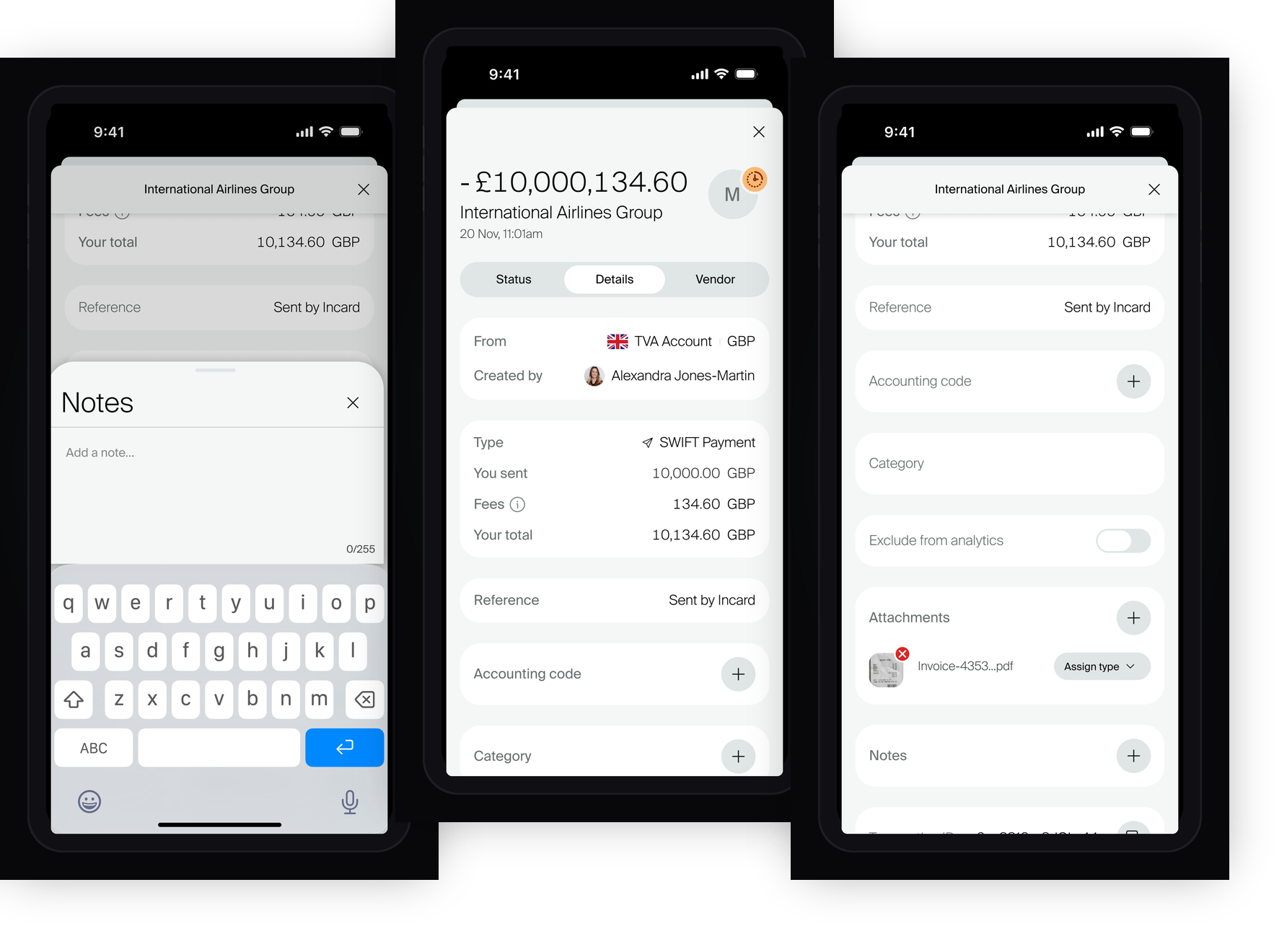
Notes sheet · category tapped · 1 attachment uploaded
Export & Action Menu
The export flow lets users download a transaction statement for a selected period. The export sheet and its scrolled state were designed alongside the transaction list action menu — which handles account and view switching.
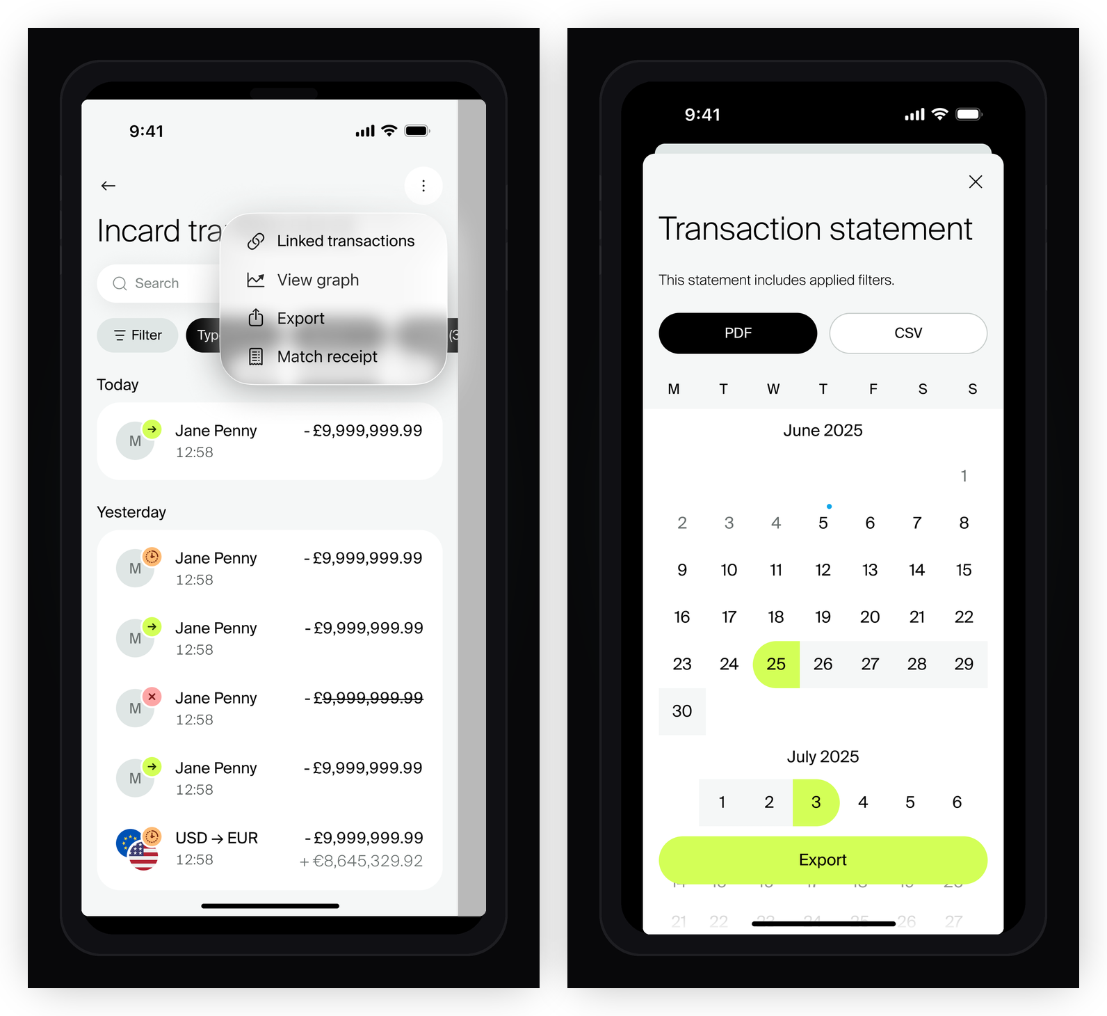
Action menu · export transactions sheet
Web Application — Transactions
Alongside the native iOS work, the transactions section was also designed for the Incard web application. The web context introduces a different interaction model — a full-width data table with filtering, pagination, and a side panel for transaction details that slides in over the table without a full navigation change.
The web design solves the same underlying complexity as iOS — the same 12 transaction categories, same status states, same filter system — but within a desktop layout where greater real estate allows for higher data density and a persistent detail panel alongside the list.
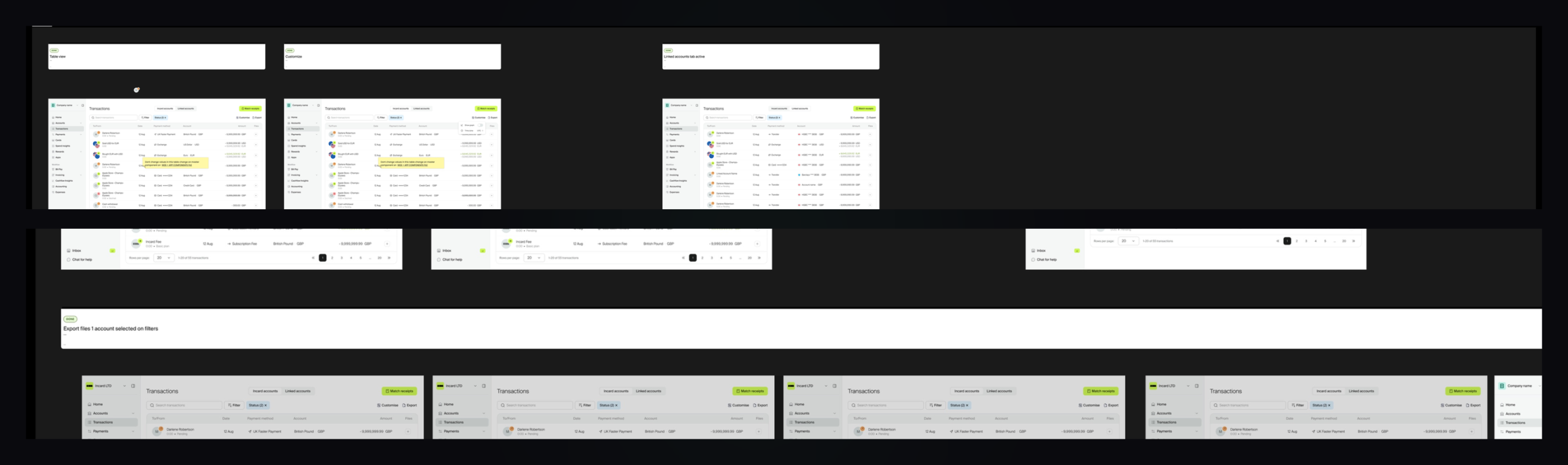
Web transaction table — default view, filter states, and date selection
Side Panel Over Table
Rather than navigating away from the list to view a detail, the web design uses a side panel that slides over the right portion of the table when a row is selected. This keeps the list context visible and lets users move between transactions without losing their place.
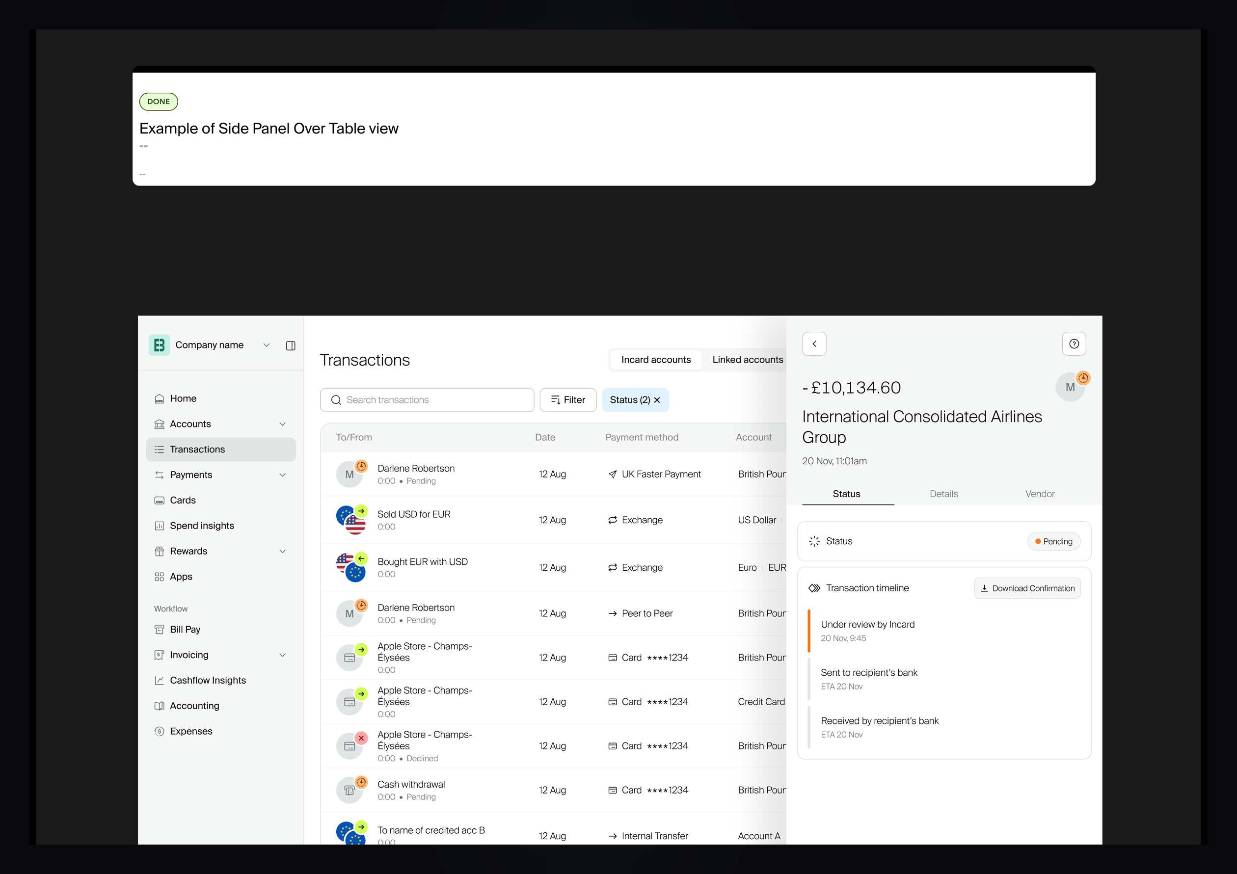
Transaction detail side panel — Status, Details, and Vendor tabs
Transaction Timeline — Web
The timeline uses progressive colour fills on each step to communicate exactly where in the payment journey a transaction sits — Under Review, Declined, Verified (Pending), and Completed — consistent across all transaction types.
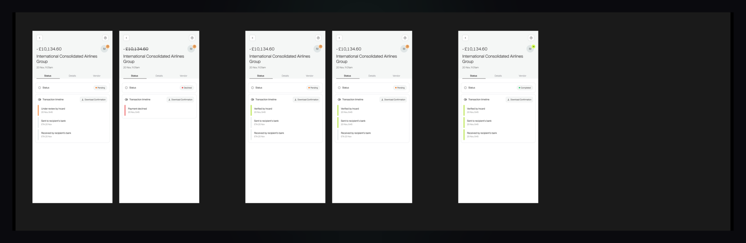
Timeline states — Pending (Under Review) · Declined · Pending (Verified) · Completed
Reflection
What made this project rewarding was the compounding nature of the work. The time invested in rebuilding the Incard design system earlier in my tenure paid clear dividends here — components, tokens, and patterns that were already in good shape meant design decisions could focus on the right problems rather than resolving system debt mid-feature. That kind of upstream investment is easy to undervalue until you see the difference it makes in practice.
The process structure — IA workshops, heuristic reviews, staged feedback cycles, and interactive prototypes for complex flows — meant that by the time high-fidelity screens were being produced, the fundamentals were already solid and agreed. Stakeholder alignment was significantly easier as a result. The prototypes in particular proved their worth: showing how a filter sheet behaves in motion, or how the account switcher transitions, consistently resolved questions that static screens left open.
Designing the same feature across two platforms also forced useful clarity about what is genuinely universal versus what is specific to a context. The side panel pattern on web, the table density, the keyboard-native filter interactions — these all differ materially from the iOS sheet-and-modal approach. Each platform decision had to be deliberate rather than a direct port, and the result is a transactions experience that feels right on each rather than compromised on both.
Above all, this project reinforced that the quality of a financial product is measured as much in its edge cases as in its primary flows. A declined transaction, an empty filtered result, a max-5 attachment lockout — these are the moments users remember, and where vague or absent design erodes trust. Covering every one of these deliberately, rather than leaving them to be improvised in engineering, was the most important discipline of the entire project.
iOS NativeWeb AppFintechUX/UI DesignFigmaTransaction DesignDesign SystemMobile App
Interested in working together?
Available for senior UI/UX design contracts and product design roles.