The Problem
The design and coding of our products components are inconsistent, never re-used or shared resulting in an inefficient workflow, longer delivery time and user confusion.
The Solution
The design and code of product components should be based on a unified platform that drives greater efficiency through being well-defined and reusable. The design system allows for planning ahead for scalability.
The Process
- Audit of existing product elements.
- Report and recommendations.
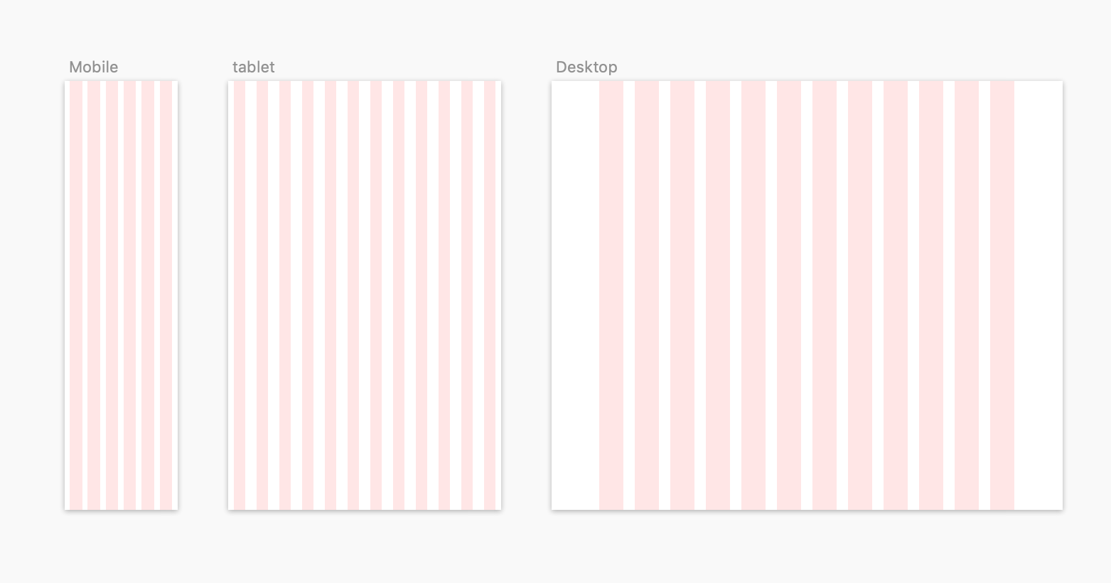
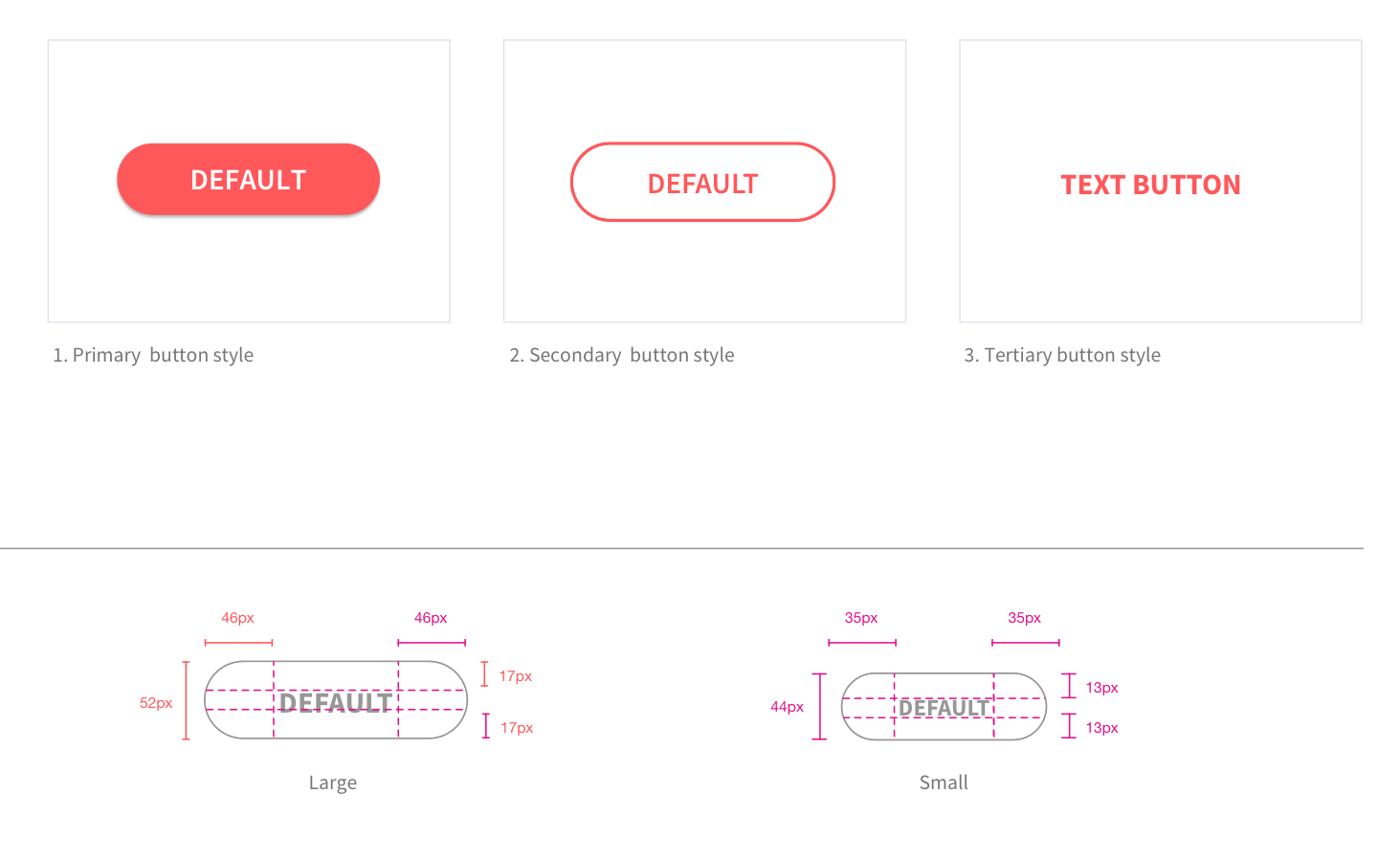
- Typography, layout grids and button Guides.
- Colour Palette Guide inc section of system colours error etc.
- Establish which component sets to be included for example forms, controls.
- Redesign a master set of shared components.
- Allow the master component set to be themed for new products.
- Run cross department workshop to decide what components are required for key commercial pages.
- Create a shared library for designers to drag and drop components into their respective sketch files.
- Work closely with development team to define each component with full documentation providing code examples.
Layout Grids

Font Guide

Form Elements

Button Guide

The Result
- Designers are more efficient by not redrawing elements over and over on new product screens and can focus on journeys and screens giving more focus on interaction and delight.
- Developers can re-use components resulting in more time in the sprints focusing on coding other aspects of a project.
- All products share a visual language which makes for a consistent user experience and a higher quality finish.
- QA Testers spend less time finding bugs.
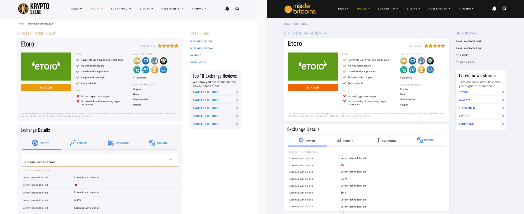
Theming Components and Screens
The next step in planning the design system components was to create a set of core screens that collectively we called a theme.
The benefit of creating a theme is that all screens share a common visual aesthetic that binds together into a consistent user experience and is tied by common design principles running throughout.
Just some of the principles that make a theme include:
- Spacing
- Alignment
- Contrast
- Ordering
- Grouping
- Hierarchy
- Motion UI
- Interaction
- Usability
- Visual consistency
I created the two illustrations below to aid in pitching to the various teams the idea that if we found a way to theme components in sketch app and in coded pattern libraries that we could roll out new product screens based on themed components enabling the company to quickly launch new products without having to redesign and re-build everything each time.
Theme Layout UX Workshop

Theme Site Map

Creating UI Components
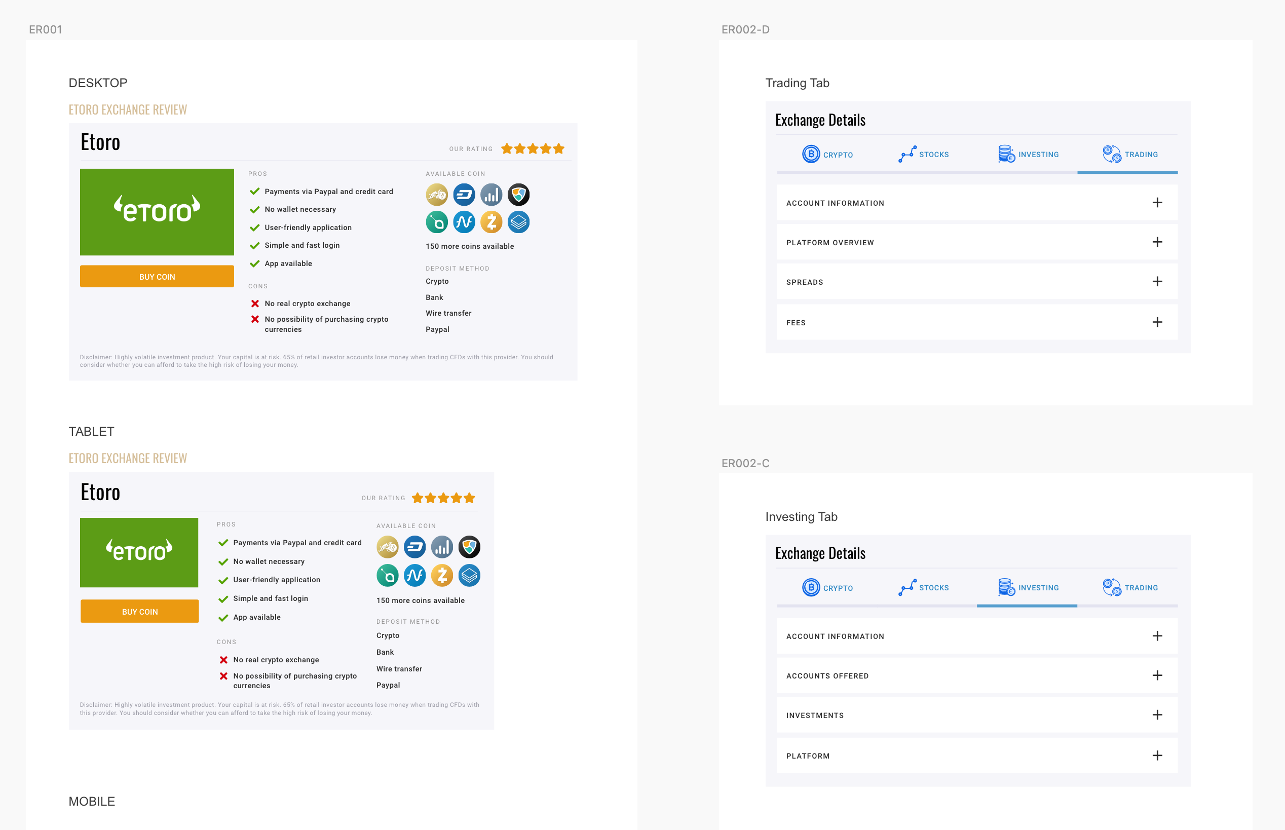
We decided to give each component its own unique code for example ER001 would be the first component we created for a crypto exchange review. Coding ensures all designers, developers and product members can reference easier with less confusion.
Common components

